Tuesday, August 23, 2011

Promotional Items – 4 Questions to Ask Before You Buy

I’ve got a junk drawer full of pens, notepads and portfolios with names of bankers, accountants, printers and others. I can remember collecting some of the logo laden swag from networking events, but to be honest - I have vague recollection of many of the gilded printed names. So, why do so many devote a significant portion of their public relations/marketing budgets to chotchkies?

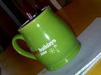
A couple of reasons come to mind quickly – there’s a sense of pride when you see your name or logo on something, it’s fun to give things away and hey - everybody else does it. But will a multicolored mug really help you further your public relations goals or just end up holding coffee for someone who is not your target demographic? My suspicion is the latter. I’m not anti promotional products, but I encourage clients to use them wisely.

Consider the following:
- How are they going to be used? (If you’re headed to a trade show – you had better have something more sophisticated than a notepad to get people talking.)

- How do you intend on delivering them?

- What’s the purpose?

- How will it help you further your public relations/marketing goals?

So what's worth your money? An informal survey amongst the savvy JBPR Facebook Fans unveiled an affinity for useful promotional items such as hand sanitizer, chap stick and stress balls.

Share your favorite items in the comments section below.


Monday, August 1, 2011

5 things to Avoid in Your PowerPoint Presentations

I had the opportunity to see TCU instructors Kelly O’Brien and Tracy Williams give guidance on the art of presenting to the five finalists of the Fort Worth Business Assistance Center’s business plan competition. In less than a month, the business owners will present their plans to a panel of judges in hopes of winning thousands of dollars in cash and prizes.

The entrepreneurs are about to embark on a high-pressured show and tell demonstration of a lifetime. O’Brien and Williams gave a lively tag-team presentation aimed at relieving the presentors' nervousness (read nausea and sweaty palms), and the participation of the future audience (read rotten tomatoes).

My favorite tidbits were in the How Not to Give a PowerPoint Presentation section. Here are the top five things to avoid:

-No more than 24 words on a slide – the more text on the screen the less your audience will retain (Try using pictures instead of words to illustrate your point)

-Limit the number of slides – (15 minutes = 8-10 slides)

-Don't turn your back on your audience and/or read word for word from your slide

-Animation – seriously people this is a distraction - use it judiciously

-A sans serif font (ie. Arial) is easier to read from the back of the room than a funky type face

In sum, less is more. Flashy fonts and animation just lead to more confusion and lower retention.